The Tufte Totem in Information Designland
Edward Rolf Tufte preceeded the digital age

I work in the freshly hyped field of data visualization.
This means that more than once I’ve been asked the question:
“What do you think of Tufte?”
For those newly wandering into this field, Edward Tufte (pronounced “TUFF-tee”) is one of the first characters to appear on the horizon, with his self-published textbooks and one-day course. He acts as a totem, symbolizing the accumulated knowledge of a discipline and pointing students in various directions.
The Tufte totem says:
- No Chartjunk!
- Maximize data-ink!
- Present many numbers in a small space!
- Above all else, show the data!
But when it comes to our work, I don’t abide by this totem for two reasons: Medium and Audience.
Blackish Ink on Whitish Paper
Tufte, born 1942, lived in world quite different than that of the digital natives who are now filling the ranks of tech and media companies. He learned and practiced visualization in the medium of print. That means posters, books, magazines, and newspapers—the lowest common denominator—consisting of smudgy ink printed on crinkly paper. That’s what your granddad folded over his knee as he sat in the breakfast nook sipping Folgers Colombian.
However, printed media has neither buttons nor millions of colorful and dense Retina-grade pixels.
Color and Pixel Density
High-volume newspapers and magazines with limited ink colors and sloppy printing results called for minimalist design to minimize the effect of inaccurate or uneven ink distribution and thus ensure that the finished product was readable. However, digital displays pack hundreds of pixels per square inch and can reproduce millions of colors. This allows for finer details and more colors without sacrificing clarity.
Interactivity
Print doesn’t have radio buttons, check boxes, dropdowns, or modals. It doesn’t have menus hidden out of sight until summoned by swipe. It doesn’t have the resizable canvas of the browser viewport. You can’t tap, pinch, zoom, drag, or drop.
Animation is another tool that is maturing in the context of visualization. And it’s another thing that print can’t do. (not until Gifpop!, anyway)
You don’t need to cram everything on the screen all at once when layers can be revealed on demand. The ability to respond to user input prevents much of Tufte’s advice from translating to interactive projects. I don’t mean to say that Tufte himself couldn’t produce great interactive pieces; it’s just that his books and courses were made for makers of print graphics who dealt with limited technology and page real estate.
For Nerd Eyes Only
Tufte’s audience was specialized. His mandate is to pack as many complex ideas, as many layers of detail, and as much data-ink into the smallest space required. He is a data purist — he stressed the importance of letting the data speak for itself. In other words, get out of the way. That, he believes, will lead to a rich experience filled with a-ha! moments for the viewer.
However, it’s a small audience that is both willing and able to spend time looking at an information-dense plot of data and coming away with rich meaning. Those are scientifically minded, detail oriented, and abstract thinking people. Maybe they are math-savvy and familiar with statistics.
As people, we don’t want simply to survive — we want to thrive. Similarly, we don’t only want our data creations to be readable—we want them to be delightful, and for a wide audience.
Meaning First, Data Second
When designing for a diverse audience, a non-expert audience, or if you simply don’t know who the audience is, aim for design that substantially aides understanding. Where Tufte put data first, strive to put meaning first.
Do this by identifying emotionally resonant conclusions that can be drawn from the data, and putting those in the forefront of the design. This is a human-centered approach that’s more inclusive than Tufte’s. Whereas his purist approach may suit linear, short-form news-reading experiences (or long-form scientific papers), there are many more narrative structures to play with
In practice, this can mean that, instead of leading with a technically sophisticated chart, you may lead with a simple graphic illustration or animation to communicate the personal importance of the content, and then afterward provide the chart and raw data on demand, as secondary reinforcement.
Here’s a specific example. Suppose you’re creating a visualization meant to convey the negative consequences of having too much credit card debt, and plan for eliminating it over time.
Start by asking these questions: What does it feel like to be carrying the burden of seemingly insurmountable debt? What would it feel like to be free of that suffering? What metaphors and illustrations can we employ to connect with those same feelings in the viewer?
This allows you to add layers of interpretation on top of data, whereas Tufte would dismiss these warm and fuzzy illustrations as Chartjunk, leaving interpretation up the viewer.
Chartjunk is Good (In Moderation)
We like Chartjunk not because we don’t have faith in the intelligence or motivation of the audience, but because attention is a limited resource, and understanding complex datasets is hard work. We want to reduce that workload and lubricate the pathways that allow ideas to flow easily from pixels, through eyeballs, and into brains. While the research is tenuous, practitioners intuitively know that “embellishments” used wisely can trigger emotional resonance and improve recall from memory.
You may be building a tool for a specialized analyst to use, but don’t rely on that fact. Acknowledge the expertise of your audience, but try to make their lives easy as well. We are all humans after all. Harness the power of human-friendly language, clear labels, and explanations on demand.
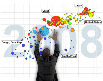
Jess Bachman (@mibi) astutely observed that Hans Rosling IS the living, breathing Chartjunk of Gapminder. His live commentary produces a nearly theatrical experience with data.
The Essential Tufte
However, Tufte should not be dismissed as irrelevant in a digital age. His work has been invaluable in promoting critical thinking and general interest in the field of information design.
Here are a few of his principles that we do follow:
- Tell a story
- Serve a clear purpose
- Make large datasets coherent
- Avoid distortion (don’t lie with data)
- Closely integrate with surrounding media
- Content dictates format (no single format is sacred)
- Redundantly encode information, use multifunctioning graphical elements
- Oh, and of course… PowerPoint is Bad
New Totems on the Horizon
For an up-to-date look at the production of information graphics, follow Alberto Cairo and read his superb book, The Functional Art. Then check out Nathan Yau and Hunter Whitney, just to name a couple other influential voices.
Shout out to data mixologist EJ Fox for contributing his thoughts on this post!